Case Study · T-Mobile

Designing for scale across consumer & business.

Five years of UX leadership across T-Mobile's eCommerce, mobile, and self-service platforms — spanning four signature projects that touched everything from multi-account architecture to digital empathy.

In this case study

  1. Account Chooser & Switcher — T-Life App
  2. Introducing the Pricing Bar to the purchase experience
  3. Introducing eSIM to eCommerce
  4. Creating the Digitally Reluctant Persona

01 · T-Life App

Account Chooser & Switcher — T-Life App

Account Chooser and Switcher screens for the T-Life app

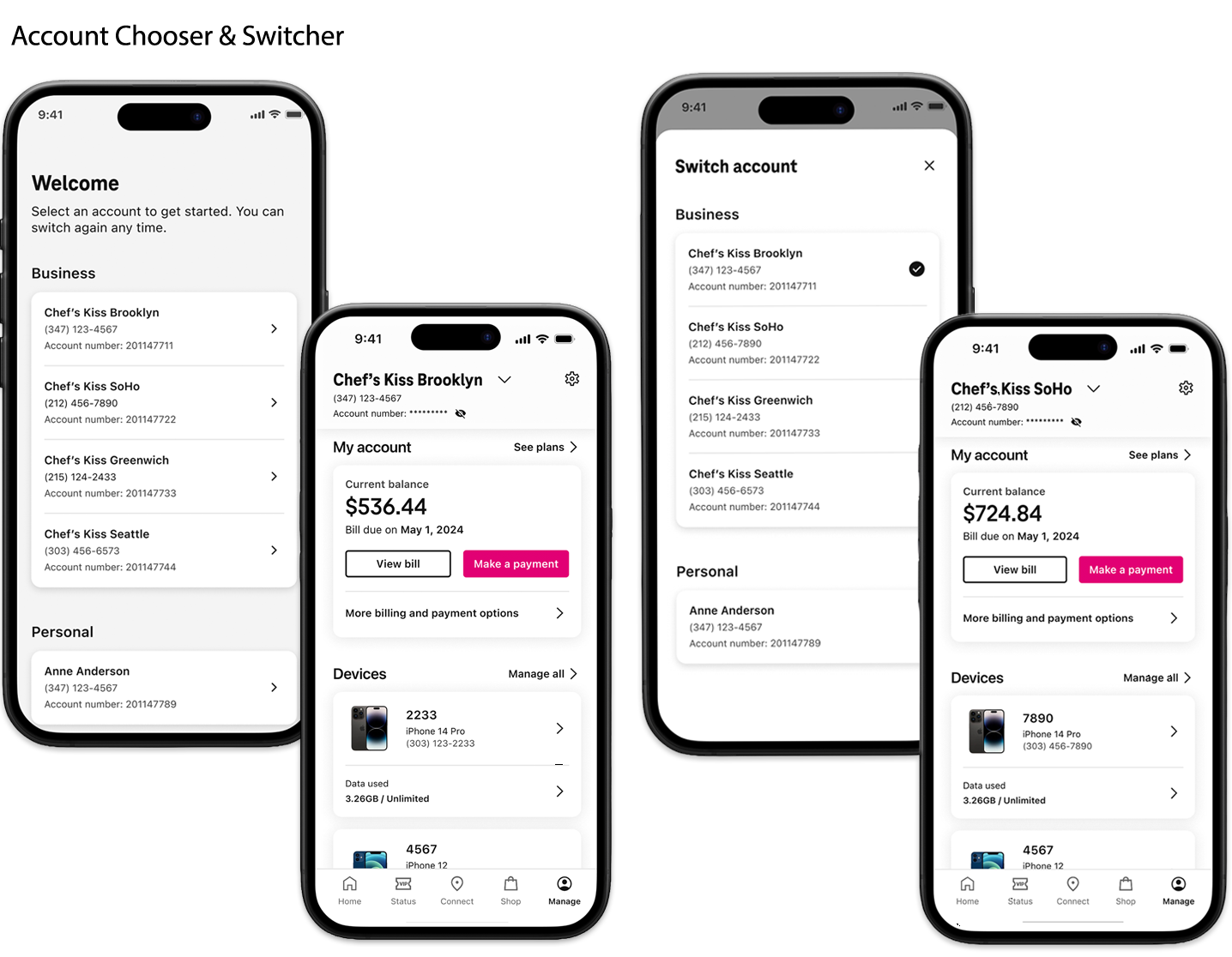
67% of T-Mobile small business users are also consumer customers, and 90% of those customers manage multiple accounts across various users and work locations. To seamlessly support this behavior within the T-Life app, I led the design of an Account Chooser and Switcher, a feature enabling users to navigate between multiple accounts from a single, unified interface.

Working closely with stakeholders from the consumer team, I helped define key requirements specific to business customers, including the ability to view and label multiple accounts with custom "friendly" names for quick identification across the app.

Interactive Figma prototype — open in full screen ↗

T-Mobile for Business products present unique engineering complexity. Unlike typical consumer products, which are built for customers managing one or two accounts with up to five lines, small and micro business customers may maintain up to five separate accounts with as many as 12 lines each. Solving for this scale also opened new possibilities for consumer use cases, such as enabling dependent account holders to manage their own accounts independently, without requiring action from the primary account holder.

One of the most significant UI challenges was reconciling the business interface with the existing consumer design system. The consumer experience used Apple ID-style avatar icons with abbreviated character limits in the header — an approach that felt informal in a business context and couldn't accommodate full business names. T-Mobile for Business architecture identified accounts by number rather than name, meaning any labeling system would depend on manual input from the primary account holder (typically a CEO or Business Account Manager), a task they were unlikely to perform.

To meet MVP requirements, the team landed on a pragmatic solution: displaying the last four digits of the account number paired with a business title to differentiate accounts at a glance. The future-state vision would allow any account user to assign custom business names, which would then automatically populate across the experience for improved organization and visual clarity.

100%

of micro business customers transitioned to managing accounts in the T-Life app post-launch

672/1000

post-launch satisfaction score — signaling adoption alone didn't tell the full story

Following launch, 100% of micro business customers transitioned to managing their accounts within the T-Life app — a meaningful shift away from a fragmented desktop experience. The feature also unlocked new self-service capabilities for consumer dependent users; however, adoption alone didn't tell the full story.

Post-launch satisfaction data revealed a score of 672 out of 1,000, which signaled that while the feature solved the right access problem, the MVP execution left meaningful gaps in the experience. The known technical constraints and stability issues affected the quality of the day-to-day interaction in ways that adoption numbers couldn't capture.

This project sharpened my thinking around how to scope an MVP responsibly when engineering constraints are as significant as they were here. Earlier and more structured collaboration between design, engineering, and QA would have surfaced the multi-account edge cases that ultimately affected post-launch stability.

02 · TFB eCommerce

Introducing the Pricing Bar to the purchase experience

Final Pricing Bar component shown on the purchase flow

Since the release of the T-Mobile for Business eCommerce site, customer dropout rates increased once customers reached the cart page. After several moderated tests, it was discovered that many customers were confused with the change in pricing that appeared in their carts. Device and plan promotion prices led to further confusion as the customer continued down their purchase paths.

It was decided that offering a price callout bar could potentially help with price and promo comprehension. This component would also assist customers with more complex orders, when product pages were revisited throughout the flow. Instead of adding an additional stepper component to mark the location within the purchase flow, price callouts would indicate when products have been added to the order.

Providing this marker has encouraged customers to shop with the confidence in estimating the cost of their current dues, and monthly bill.

Lo-fi exploration of the Pricing Bar component
See the full experience live →

03 · BYOD · MVP

Introducing eSIM to eCommerce

eSIM flow design for T-Mobile for Business eCommerce

Starting off as an MVP project, eSIM was introduced to the TFB eCommerce platform; beginning the improvements of the Bring Your Own Device (BYOD) self-service feature. Once the project was green-lighted, I felt that it was imperative to educate our customers on something that would be drastically different than what they were used to — activating an electronic device vs. purchasing a classic physical SIM card.

Partnering with the marketing team and Adobe Experience Manager (AEM), the goal was to create a clean and simple design that prospective customers could comprehend, and would influence the conversion to T-Mobile. This design has been adopted for use within our Enterprise and Account Hub platforms.

See the full experience live →

04 · Research & Strategy

Creating the Digitally Reluctant Persona

Digitally Reluctant sub-personas research artifact

Dedicated to cultivating a nuanced understanding of digitally reluctant customers, I directed a significant portion of my efforts last year towards the creation of Consumer Personas. My focal point was the Assisted/Co-Browsing experience, tailored specifically for this demographic.

In collaboration with our frontline researcher, I played a pivotal role in formulating a robust research strategy and plan. This initiative aimed at constructing sub-personas and meticulously evaluating the nuanced needs inherent in an assisted digital experience.

The inception of the Co-Browsing prototype, crafted in partnership with our Principal Designer, became a pivotal exploration into the pain points faced by current customers, frontline team, and Care employees. Through this iterative process, crucial findings emerged, serving as the compass for introducing the Digital Assisted experience to T-Mobile customers.

This endeavor not only fulfilled a personal goal but also showcased my active engagement with the User Research team, ensuring that the methodologies employed are not only rigorously tested but also tailored to the unique demands of customer products.

Up Next

Keep exploring the work.

← All Projects Byredo →